What is CAPE and why is it important?
CAPE is an important element in weather forecasts, especially during thunderstorm season.


CAPE is an acronym that stands for Convective Available Potential Energy and the term gains special significance during the summer because its measurement can give a forecaster insight into the likelihood of thunderstorms. Simply put, CAPE is a measurement that describes the potential for a parcel of air to rise and continue to rise and form the cumulus clouds necessary for thunderstorm formation. As you might expect, however, it’s a little more (okay, a lot more) complicated than that. I’ll try to break it down into understandable terms because understanding CAPE can be extremely useful to us as weather observers.
Where does CAPE come from?
CAPE is derived from soundings that take place vertically in the atmosphere, usually from weather balloons sent aloft from National Weather Service stations around the country. Each of these weather balloons measures such things as temperature, dew point, and pressure. Each sounding gives the forecasters a profile of one little vertical slice of the atmosphere; a multiplicity of such soundings gives a broader overall picture.
Once the data from the soundings are obtained, they are plotted on what is known as a Skew-t chart. A Skew-t chart contains lines representing the wet and dry adiabatic lapse rates, temperature, and elevation against which the data are plotted. The resulting chart can give a forecaster a picture of instability in the atmosphere and, as we all know, it is instability that breeds thunderstorms.
CAPE is measured in joules per kilogram, or j/kg. This number becomes important, as we will see shortly.
Dissecting a CAPE plot on a Skew-T chart
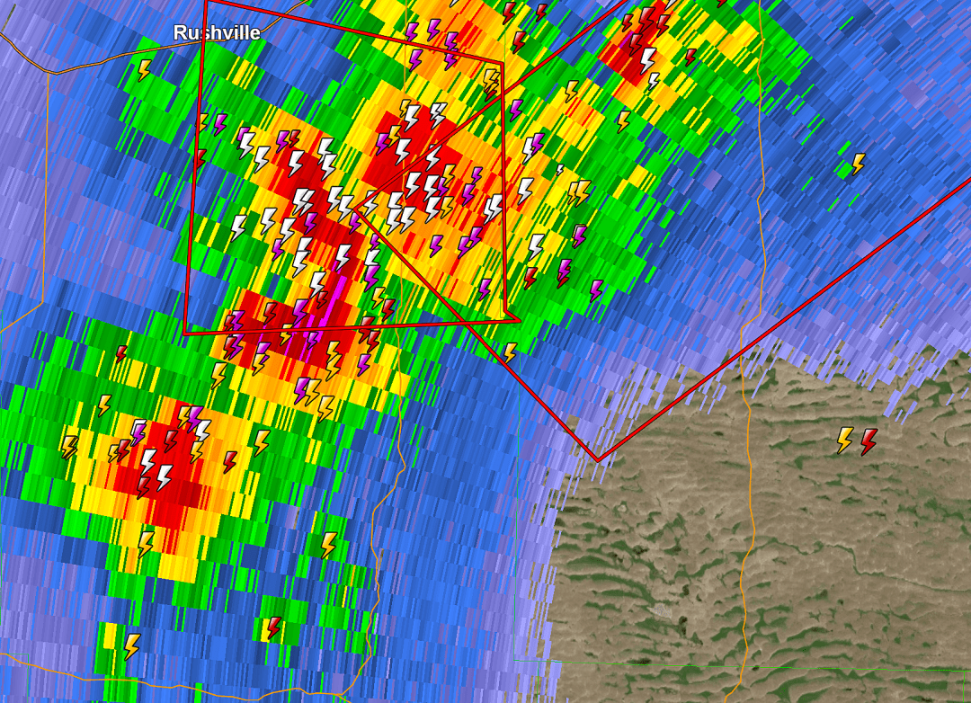
The representative Skew-T chart (Fig. 1) below (the large chart in the upper left of the sounding) is typical of a summertime CAPE plot. We’ll ignore the rest of the chart for now. This sounding was generated by the Global Forecast System model for an area in west-central Missouri on 24 June 2021 during a very active thunderstorm afternoon. The radar image below (Fig. 2) was taken at the same time. This is a storm chaser’s dream profile.
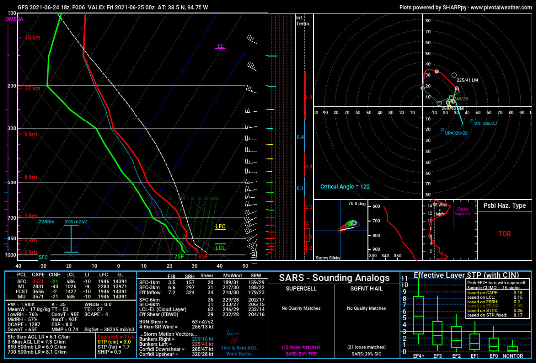
The left margin of the skew-t chart is the altitude in millibars, with 1000 Mb representing sea level and 100 Mb approximately 50,000 feet. The bottom margin represents temperature in degrees Centigrade from -40° to +50°. Dew point temperatures are represented by the green line on the left. The right margin shows wind barbs indicating wind speed and direction with altitude.
Let’s consider a representative parcel of air beginning at the surface at the bottom of the red line. The red line represents the temperature of the atmosphere surrounding the parcel. The dashed white line to the right represents the temperature of the parcel of air. In this example, the temperature of the parcel of air starts out at a slightly warmer temperature than the surrounding atmosphere, so it’s already got a head start. This is possibly the result of surface warming washing out any inversion that might have existed earlier in the day.
The first marker to the right of the lines is the LCL, the Lifting Condensation Level. This is the point at which the water vapor within the parcel begins to condense into visible moisture, the parcel is saturated, and clouds begin to form. Thus, the LCL represents the approximate base of the clouds.
As the sun heats the earth beneath the parcel of air, the parcel becomes warmer and begins to rise. The point at which the Level of Free Convection (LFC) begins is also known as Convective Inhibition (CIN) or the cap. CIN may or may not coincide with the LFC, but they’re generally close together. The cap normally keeps a parcel of air from rising further. There are basically three ways for an air parcel to break through the cap—sufficient heating, lifting, or a combination of the two. Both factors frequently come into play, especially in a mountainous state like Colorado, as daytime heating of the earth heats the air above, causing it to rise. Lifting can be caused by terrain such as mountains (orographic lifting), or by a cooler air mass moving in and forcing the air upward (frontal lifting).
Here’s where it gets interesting. As the air parcel gains enough energy to break through the cap (around 20 j/kg or less), it crosses the Level of Free Convection. At this point, the parcel, which is now warmer than the surrounding atmosphere, is buoyant and will continue to rise. Condensing water vapor also releases latent heat, adding to the energy propelling the parcel upward. The greater the difference between the temperature of the air parcel and the surrounding air, in other words, the farther to the right of the red line the dashed white line lies (or the greater the area between the two lines), the faster the air parcel will rise. On the Skew-T chart above, the area between the two lines represents a significant positive CAPE on the order of 3,700 j/kg. This is a very unstable atmosphere, ideal for thunderstorm formation, as we see in the radar image above.
As the parcel of air continues to rise, it gradually cools. At some level high in the atmosphere, generally at the tropopause where the troposphere and the stratosphere meet, the air parcel’s temperature cools enough to equal that of the surrounding air and the parcel reaches its Equilibrium Level (EL on the Skew-T chart). At this point, the parcel stops rising and this denotes the top of the cumulus cloud.
Because high CAPE values generally allow an air parcel to rise more rapidly, the parcel may break through the Equilibrium Level in what is known as an overshoot. If there is sufficient horizontal wind shear at that point, the overshoot may be blown out ahead of the storm, resulting in the classic anvil top.
If the temperature line (dashed white) of the air parcel and the temperature line of the surrounding atmosphere (red) are close together, the CAPE values are low and there will be less convective lifting. In other words, the atmosphere is more stable, making thunderstorms less likely. CAPE values can be negative as well as positive. Negative CAPE values represent an extremely stable atmosphere where a parcel of air descends relative to the surrounding air. Clear skies are likely in this scenario.
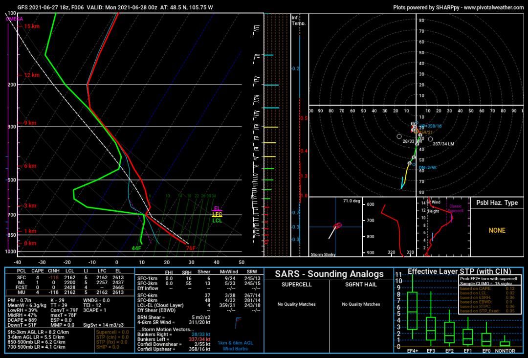
The sounding below (Fig. 3) from northeastern Montana is a good example of negative CAPE. The white dashed line representing the air parcel temperature is well to the left, i.e. cooler than the surrounding atmosphere. This sounding shows very stable conditions. Note also that LCL, LFC, and EL are very close together. Any clouds present would likely be in a very thin layer.
So, what does it all mean?
Remember we said that CAPE values were expressed as joules/kilogram. The table below illustrates some representative CAPE values and their corresponding stability:
Cape Value Stability
0 Stable
0-1000 Marginally Unstable
1000-2500 Moderately Unstable
2500-3500 Very Unstable
3500 or greater Extremely Unstable
Keep in mind that CAPE is just one measure of the potential for thunderstorms. There is no minimum value above which thunderstorm formation is certain, but the likelihood of thunderstorms increases with a higher CAPE. The type and speed of lifting and the amount of available moisture are also considerations, along with others that we won’t go into for the purposes of this article.
 Keith R Thompson, WeatherHawks
Where can I find CAPE values?
CAPE values are frequently mentioned in the Forecast Discussion on the local NWS Forecast Office’s web page. Look below Additional Forecasts and Information for a link to the Forecast Discussion (Fig. 4).

Several weather apps on IOS and Android will also allow CAPE values to be overlaid on the map. Windy on IOS and Google Play is one example. Some weather radar apps will also allow a CAPE overlay.
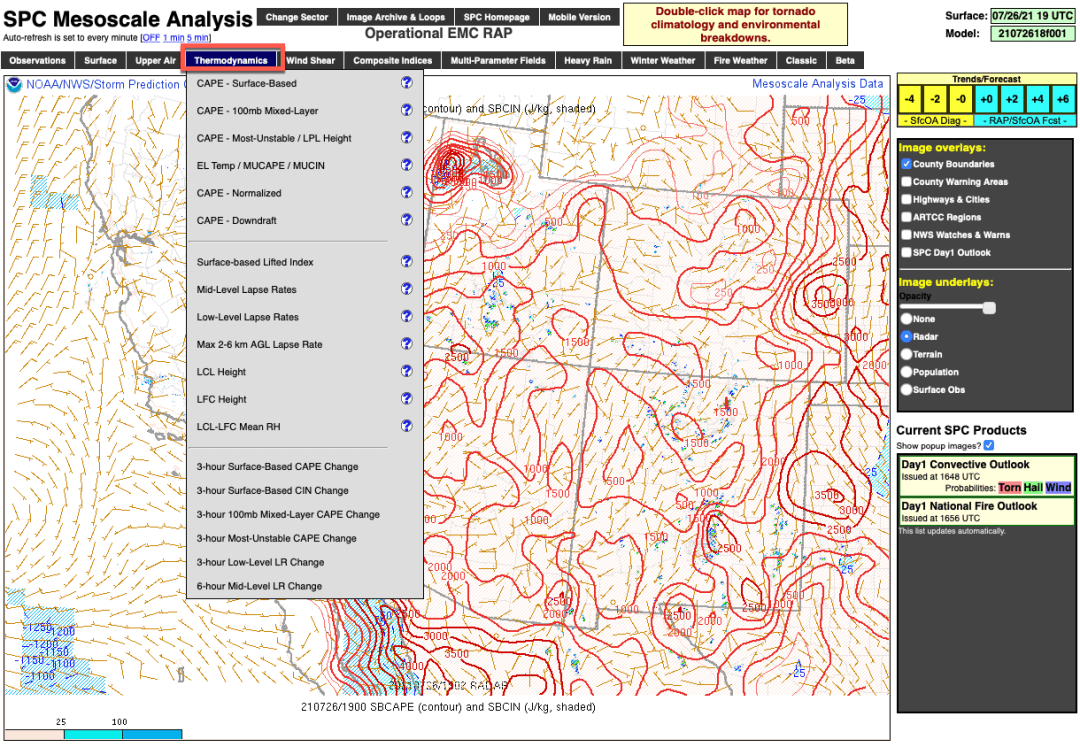
Another excellent site for CAPE overlays is NOAA’s Storm Prediction Center’s Mesoscale Analysis Pages. Click on the grid that includes the area of the US in which you are interested. That will bring up a surface analysis map beneath a menu. Select the Thermodynamics tab and then select the CAPE layer you are interested in (Fig. 5).
The NWS Sounding Analysis Page contains the Observed Sounding Archive. Click on the chart under the Today heading and then click on a star on the map nearest your desired location and a sounding chart similar to the ones above will appear. Most states only have one or two NWS stations that take soundings with weather balloons, so sounding plots for other locations are derived from the various forecast models. Pivotal Weather, a subscription service, is a great source for model-derived sounding plots for any location you need. All of the Skew-t charts in this article are courtesy of Pivotal Weather.
CAPE is a useful index to add to your weather toolbox and this year I’ve become more aware of its frequent mention in NWS Forecast Discussions than I recall from previous years. More and more storm chasers are also using CAPE to determine where their best chances are to encounter severe storms (check out Tornado Titans for some storm-chasing fun). As forecasters gain more data and continue to refine CAPE, it’s assuming an increasingly important role in weather forecasting during thunderstorm season.