Interpreting the Surface Analysis Chart
The surface analysis chart shows the factors affecting your weather, now and in the future.

Surface analysis charts can give you both a synoptic, or large scale, view of weather features, as well as mesoscale, or smaller scale, features. Surface analysis charts show locations of fronts, highs and lows, squall lines, dry lines, and other weather phenomena that are important in understanding current weather and predicting future weather events.
Surface analysis charts have been in common use since 1942 when they were issued by the US Weather Bureau, followed by the National Weather Service. They are generally based on the Norwegian Cyclone Model over land surfaces. Responsibility for generating surface analysis charts ranged from the Honolulu Forecast Office for the Pacific Ocean, the National Hurricane Center for the Atlantic Ocean, and the National Meteorological Center for the Northern Hemisphere from the equator to the North Pole, including adjacent ocean areas. The northern Pacific was handled by the Anchorage office. This resulted in much duplication of effort, so in 2001 each of the offices was confined to its particular area of operations and all the maps for much of the Northern Hemisphere were consolidated into a single map for much of the hemisphere.
Within the United States, there are over 2,000 METARS (Meteorological Aerodrome Reports) reported by civilian and military airports, generally available between H+0:05 and H+0:10, which give the Weather Prediction Center (WPC) a very dense dataset. In addition, there are 50,000 sites available through the US mesonet at the Global Systems Division. All of this data allows the WPC to generate a new surface analysis chart every three hours.
Examples of Surface Analysis Charts
Interpreting surface analysis charts is not difficult and the National Weather Service’s Weather Prediction Center provides a free downloadable guide, the Unified Surface Analysis Manual, that explains many of the features displayed on the map. We’ll look at a few of the primary features here and you can refer to the USAM for additional details.
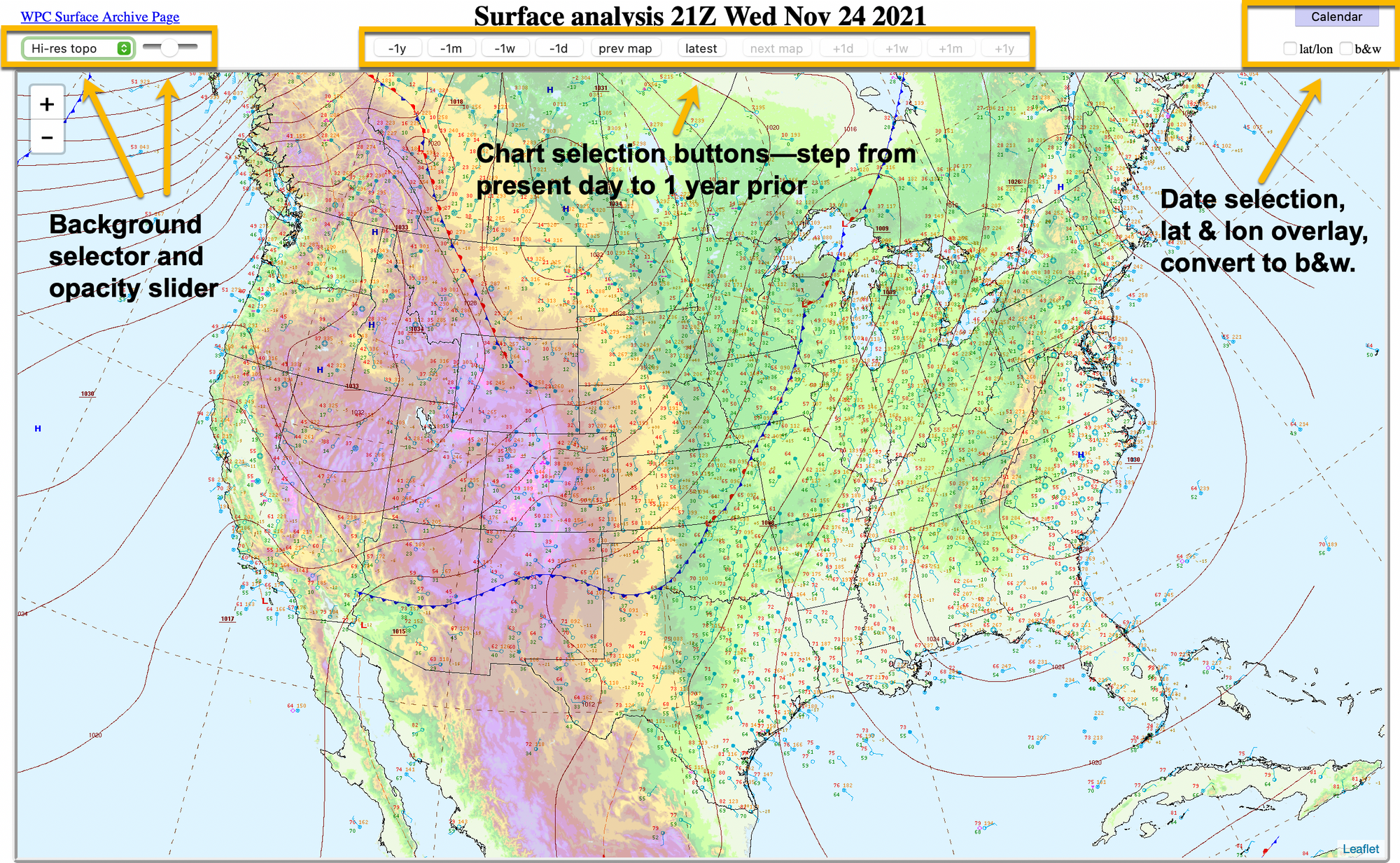
Shown above is the Weather Prediction Center’s daily interactive surface analysis chart. This chart allows you to select the background and its opacity; step through from present day to as far back as one year; select a particular calendar date to display a map from the archives and then use the step buttons to move back and forth around that date; display a latitude and longitude grid or display the chart as a black and white image.
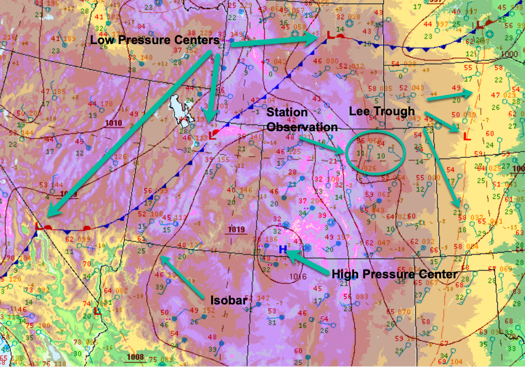
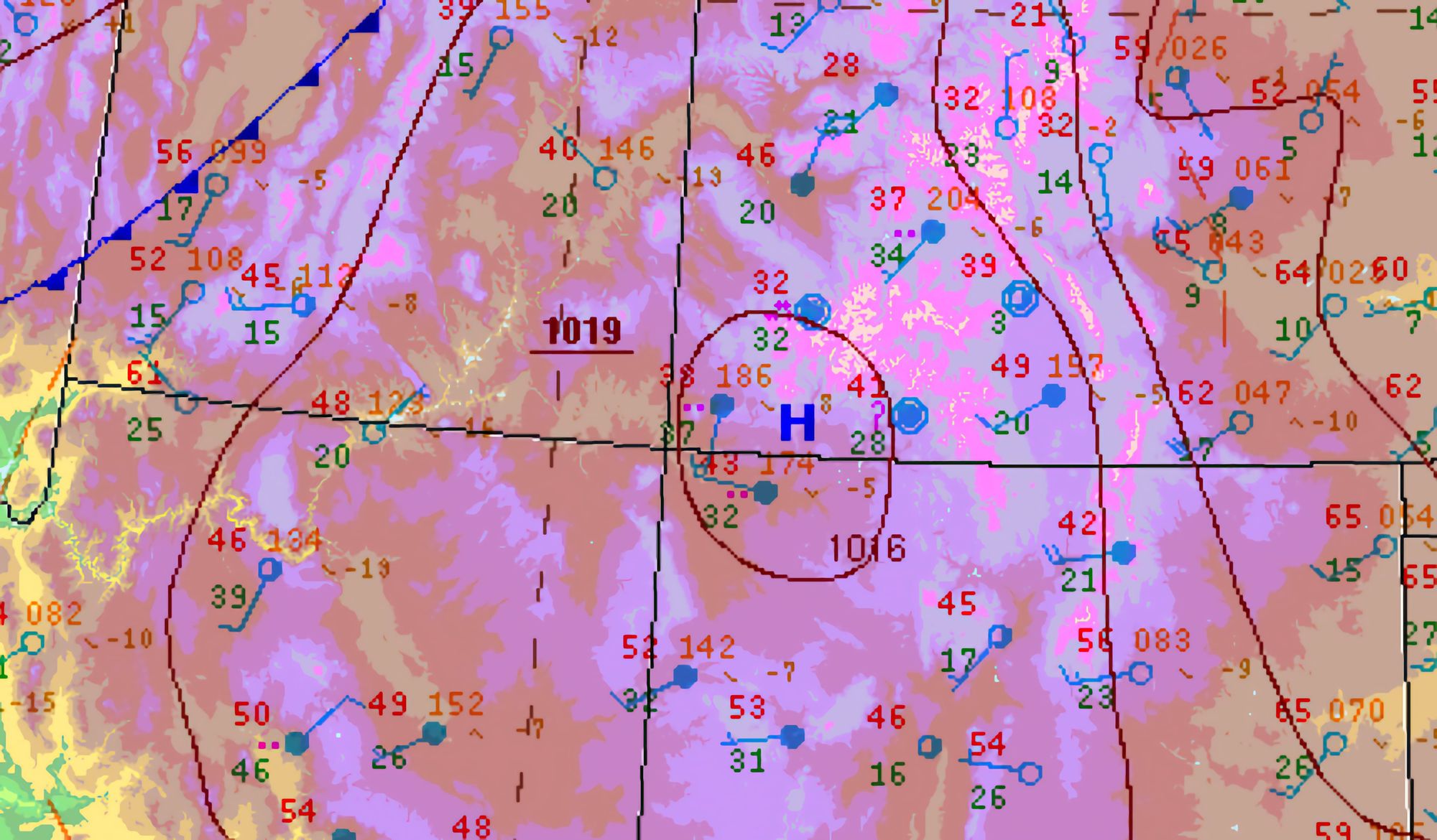
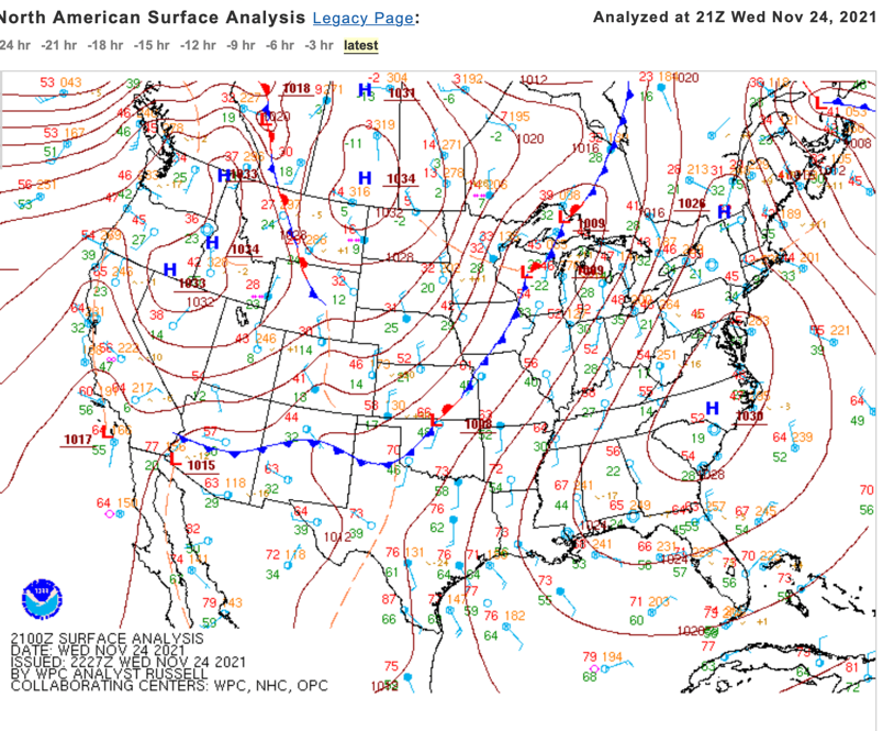
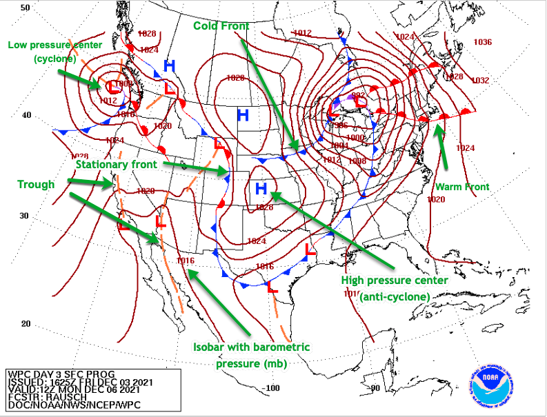
Above is segment of the surface analysis chart showing some detail. High and low pressure centers are clearly shown, along with the weather fronts connecting them. Isobars connect equal pressure. A lee trough is present east of the Rocky Mountains. Station observations, including winds and temperatures are plotted throughout the chart. One caveat with station observations—occasionally, there are so many observations plotted that it becomes hard to discern what goes with what.
The Weather Prediction Center also publishes a somewhat simplified surface analysis chart accessible from their home page. The first chart, below, shows a few stations, isobars, fronts, precipitation, and pressure centers.
The Fronts tab on the WPC home page gives an even simpler surface analysis chart (below), with much of the information removed with the exception of isobars, highs and lows, and fronts.
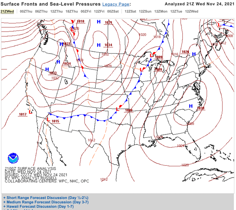
Chart Symbology
Station Observations
The Unified Surface Analysis Manual discusses the standardized symbols used on surface analysis charts within the Northern Hemisphere. The illustration below gives examples of the symbology you will find on most surface analysis charts used today.
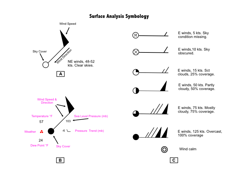
As indicated in A above, wind direction blows toward the sky cover symbol. Note also that upper level wind charts display winds similarly to the wind symbol above, except without the sky cover symbol. A station plot, shown in B above, displays temperature (57°F), dew point (24°F), the weather occurring at the time of observation (moderate rain), sky cover (overcast), wind (48-52 kts), sea level pressure (1010.3 mb), and the pressure trend. In this example, the pressure has dropped six millibars in the last three hours and the trend line is a decrease in pressure followed by steady pressure.
Barometric pressure is read in millibars, with 1013 mb representing 29.92” of mercury, standard pressure on a standard 15°C day. The leading 9 or 10 is omitted. Typical pressures are abbreviated on the charts as follows:
410—1041.0 mb 987—998.7 mb
103—1010.3 mb 872—987.2 mb
Note the convention. Millibars are always to one decimal place. A low pressure beginning with “9” or an “8” will have a “9” placed in front. Higher pressures will have a “10” added to the front.
C, above, shows examples of sky cover, wind speed and direction, obscuration, and missing sky conditions.
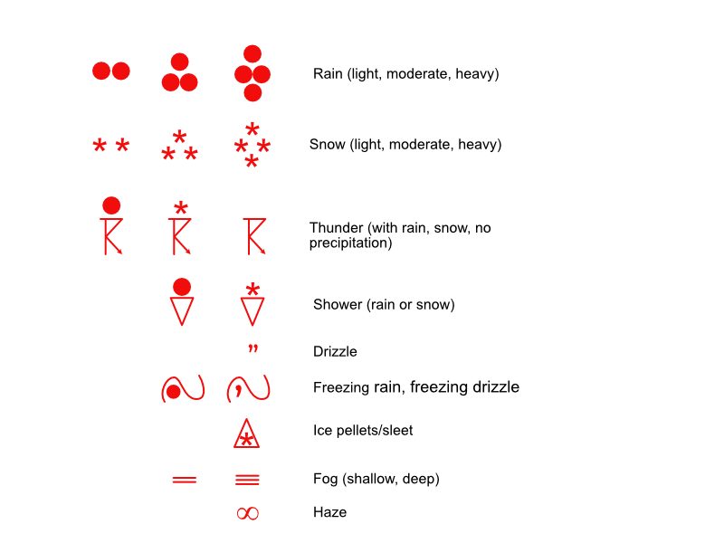
Precipitation and Weather Conditions
Below are some of the symbols used to indicate weather conditions:
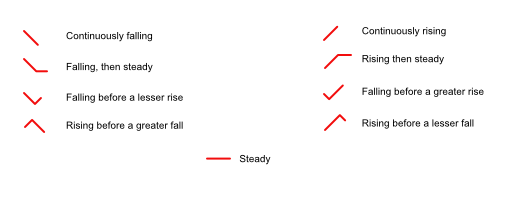
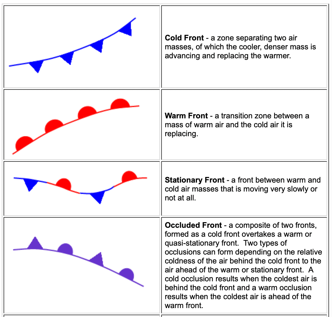
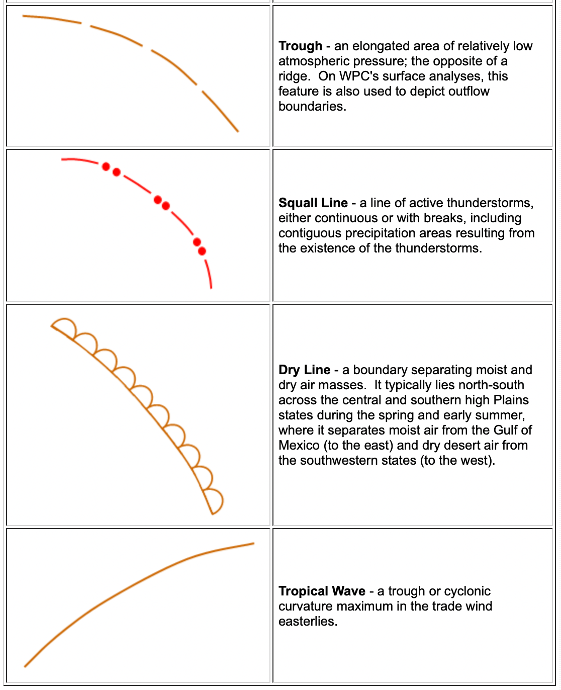
Frontal and Pressure Boundaries
Fronts and pressure boundaries, such as troughs and ridges, are shown as follows:
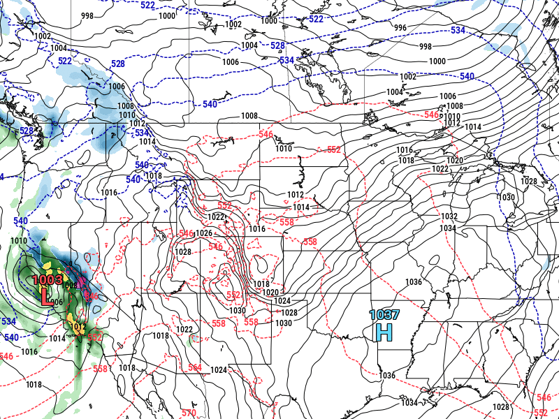
Below is a WPC surface analysis forecast chart with some of the features shown above:
There are additional features that frequently appear on surface analysis charts, such as short waves, long waves, squall lines, and outflow boundaries, but the features and symbols outlined in this article will give you a basis for understanding most common surface analysis charts issued in the US and abroad. A search for surface analysis charts on the National Weather Service’s website will provide enough information to continue expanding your ability to understand and interpret this essential tool.